PRESENTATION DESIGN
why visuals are so powerful in Presentation Design
5 Reasons why visuals are so powerful in Presentation Design.
5 Reasons why visuals are so powerful in Presentation Design.
65% of people are visual learners.
According to one study, only 10-20% of information was retained over time when represented through written word, but that number increases to 65% when the information was presented visually. In fact, Psychologist Jerome Bruner of New York University shows that people only remember 10% of what they hear, 20% of what they see but about 80% of what the see. Also 83% of learning occurs visually. This is because visuals are processed in a different part of the brain, called video space sketch map, giving you a much stronger and vivid memory, letting you remember what you said and why it is important.
Humans think in pictures. This aptitude comes from our early ability to see before speaking as a baby. The child looks and recognizes before it can speak. So, before being able to speak, babies are able to understand, recognize the world and even communicate because they can think without using words. Visual image consist in our very first apprehension of the world and as a result, our first tool to think and communicate. As grown up adults, we still think and communicate using pictures. This ability consists in and alternative to language barriers. Indeed, whenever two human beings do not share the same language, they can try to communicate through non-verbal communication and images.
But what are the 5 specific reasons that we should be aware of about the importance of inserting visuals in every slide of our Presentation?
But what are the 5 specific reasons that we should be aware of about the importance of inserting visuals in every slide of our Presentation?
Did you know your brain can see visuals that last for just 13 milliseconds? That is an insanely short period of time, yet your mind can still retain that visual. Along with this incredibly short amount of time needed to retain an image, 90% of information transmitted to your brain is visual. The reality is you are hardwired to see information much more than you are to hear it. As a presenter, that means you have the unique ability to deliver information quickly using compelling imagery that cannot be achieved with the written or spoken word.
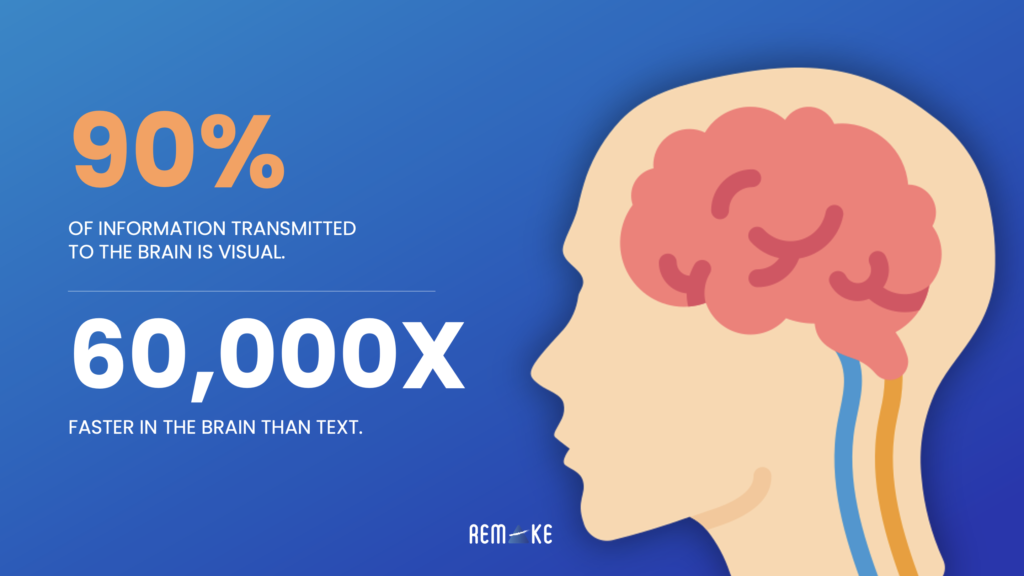
Visuals can provide a more efficient explanation to help people understanding a concept or an idea. Graphic interpretations are instantaneous and easily accessible comparing to text. Indeed text involves more efforts from your brain as you have to decode text on a linear and sequential manner to interpret the meaning. On the contrary, the brain is adapted to interpret simultaneously various images and is able to process them 60,000 times faster than text.
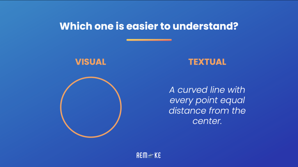
Just look at these 2 slides and to notice the difference:
Secondly, when information is paired with a visual, it is much more likely to stick with that for the long term. That visual becomes an information index card which the brain can reference later on to recall the information. A great presentation design can serve as that visual index card for all the information you are trying to deliver, don’t underestimate the power of the visual.
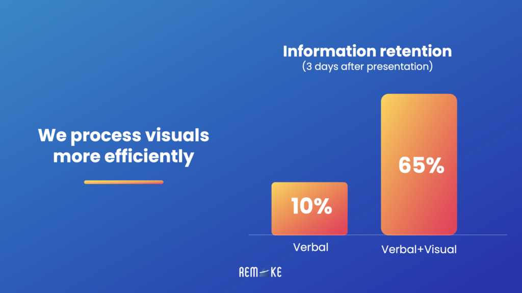
Visual aids can help your audience understand and remember the content that you discuss visuals provide emphasis to what you said. According to a study by the US Department of Labor, you can increase your audience’s retention level significantly by appealing to more than one sense at the same time. Three days after a presentation, a person that only listened to the presentation remembers only 10% of the information, while a person that experienced both the verbal and the visual aspect of the presentation remembered 65%.
This is because visual elements also happen to be easier to remember because of the process engaged by our brain. Certainly, words and images are processed differently. We use our short-term memory to retain words whereas images go directly to our long-term memory.
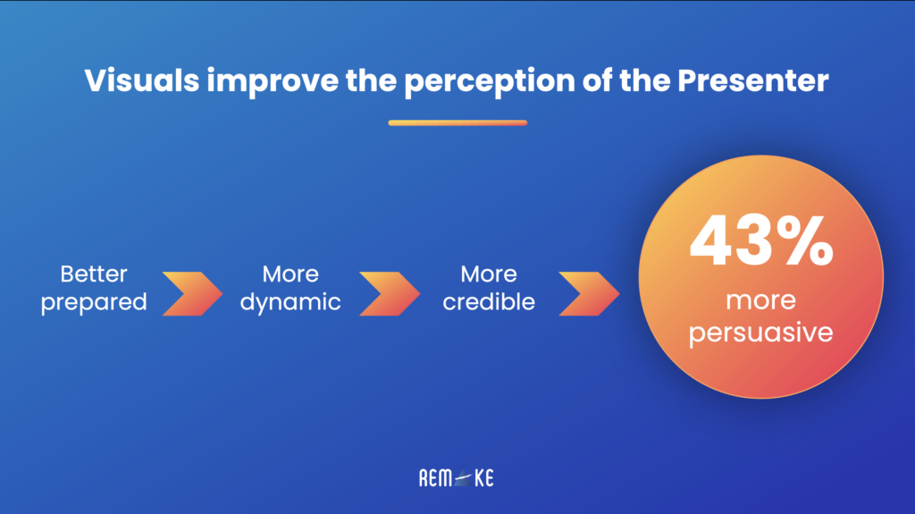

Another experiments, led by the Stanford Persuasive Technology Lab, shows us how design counts in the perception of a product. In this experiment they asked 2,440 participants to evaluate the credibility of a website an 46,1% declared that the design of the website was the first criteria they chose to make their opinion about it.
Moreover, Robins and Holmes (2008) showed that this opinion based on the website appearance is approximately made in 3.42 seconds. So this experiment shows us that about half of the population builds their opinion very quickly and on appearance criteria.